When designing for both desktop and mobile, users typically start with one platform—some begin with desktop, others with mobile. And now, thanks to a major update in how XP Studio handles responsive styling, it doesn’t really matter where you begin.
We’ve introduced a new logic for device-specific settings that speeds up your workflow and gives you more control:
🔄 Here’s how it works
Previously, if you wanted to style an element (like a button) across both desktop and mobile, you had to manually apply the same settings—like colors, spacing, or shadows—on each device. With the new system, you only need to style one device. The other will automatically inherit those settings, unless you specifically override them.
For example:
You style a button on mobile with a background color, text color, spacing, and a shadow. Desktop will now use those same styles by default. Want larger text on desktop? Just change the font size there—XP Studio will keep the rest synced.
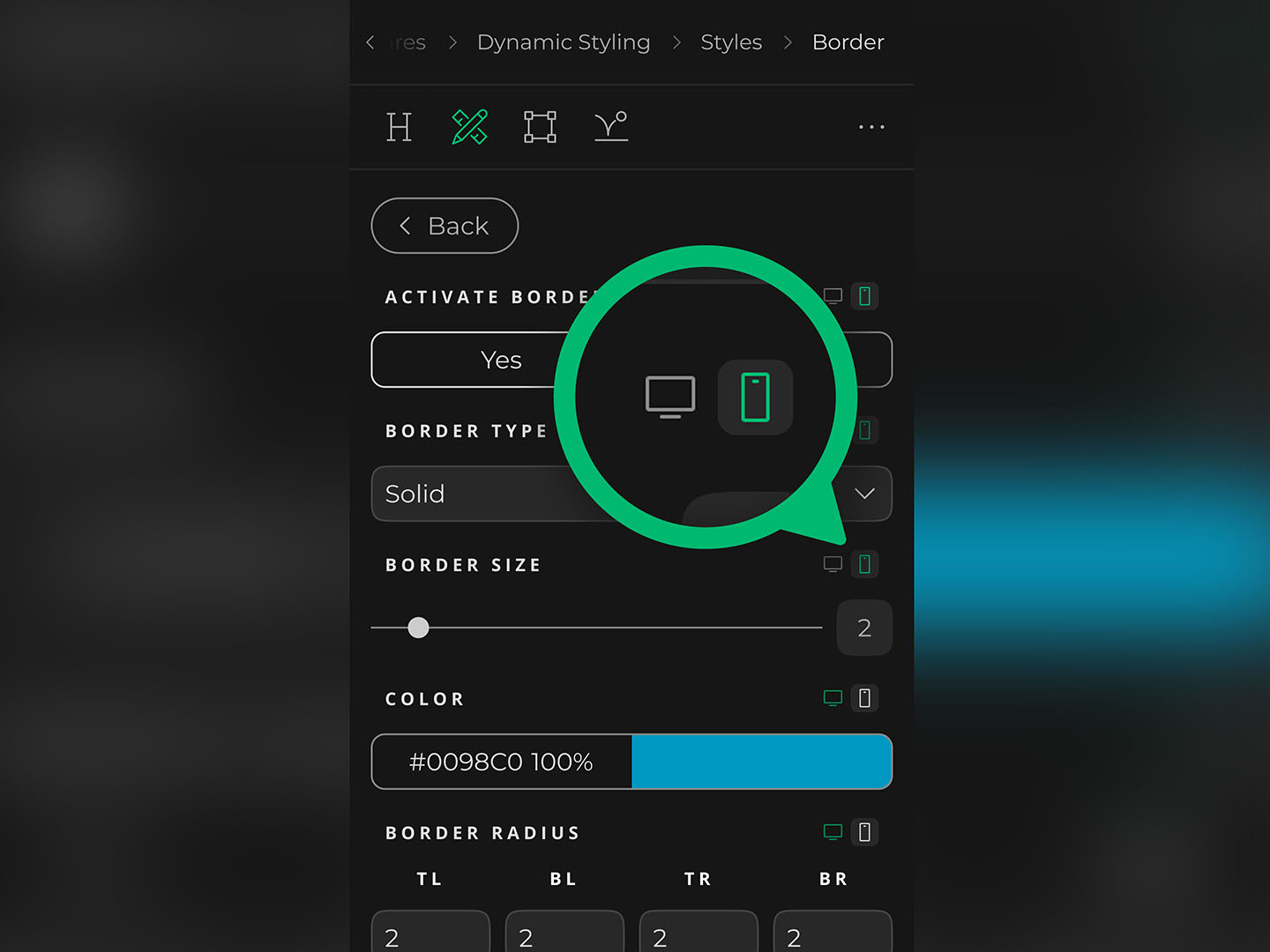
👁️🗨️ Better visual indicators
We’ve also redesigned the responsive icons next to each setting. They now clearly show which device a setting has been customized for. This gives you a much clearer overview of your interactive design and helps you spot device-specific styling at a glance.
📌 Summary
Style once – Your changes carry over automatically to the other device.
Override only what’s needed – Customize details without starting from scratch.
Visual clarity – Instantly see which device each setting applies to.
This update makes it faster to build responsive layouts—and much easier to maintain a clean, consistent design across devices.